ARIMA model output
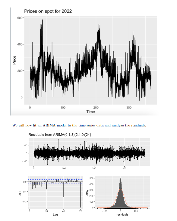
I have tried to do a time series analysis of the eletricity prices for 2022 via R. The prices are recorded hourly and plottet hourly, but the x axes is in days to get a sense of where we are in the year.
As time series is a new subject for me I have a hard to interpreting the outputs and graphs.
Can someone interpret the plots from the uploaded image and tell me if there is anything obvious to notice, what looks good and what looks bad? also why?
The SD of the residuals was 19, maybe put some words on that aswell.
29
Answer
Answers can only be viewed under the following conditions:
- The questioner was satisfied with and accepted the answer, or
- The answer was evaluated as being 100% correct by the judge.
3.7K
The answer is accepted.
Join Matchmaticians Affiliate Marketing
Program to earn up to a 50% commission on every question that your affiliated users ask or answer.
- answered
- 1238 views
- $20.00
Related Questions
- Number of different drinks that can be made using 6 ingredients
- Choosing the right statistical tests and how to organize the data accourdingly (student research project)
- Conditional mean and variance for joint PDF
- Probability that the distance between two points on the sides of a square is larger than the length of the sides
- Joint PDF evaluated over a curve $P_{U,V}$
- Find the maximum likelihood estimate
- Two statistics proofs with regressions, any help much appreciated!
- Weighted average issue

Feel free to ask questions, I have the code and can provide a summary for the ARIMA model coefficients aswell.
I would increase the bounty substantially for an advanced question.
I second that.
Increased to 20