Prime gap pattern in these plots?
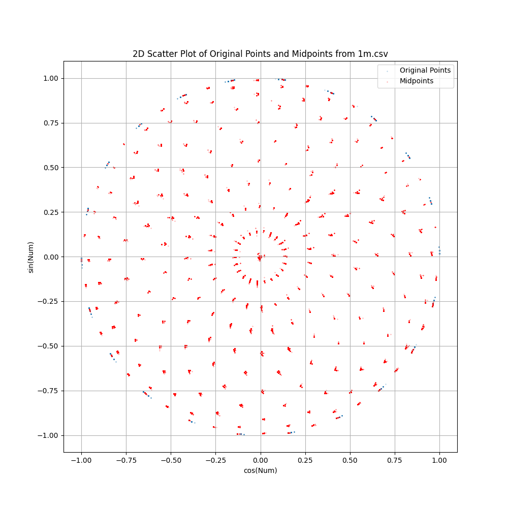
I wanted to 'normalize' all primes so they could be compared. So I tried plotting them on the unit circle and for some reason turned on the line between samples. What appeared was evidence of concentric rings formed by the lines intersecting. So I plotted the midpoints of the segments between consecutive primes. What appeared was some fuzzy concentric rings. At this point my visualization tool is not great, but I included some images with different amounts of samples. The center of the 1M sample chart appears to be a blob until it is zoomed to reveal a finer ring structure and some emerging rings.
EDIT: Added more charts. Found that all plotted midpoints are unique.
EDIT: Ran with 10M primes. More rings appearing as expected. Ran with 100M primes....out of RAM. Added three charts for the 10M primes run, including the histogram.
One thing that I thought was interesting is that the histogram for 10M point looks almost the same as the 1M point histogram, so it appears that points distribute similarly across the plot, possibly indicating a broad pattern in the primes.
Still at 10M primes, the plotted midpoints continue to be unique.
I could find resources to run with more primes or chunk the data, but maybe there is nothing useful here. Just a transform that produces a curious pattern.
EDIT: Added a colormap chart to show the relative prime gaps. It appears that the function is sorting the midpoints according to the prime gap with the smallest gap toward the center of the band. The question remains - what is causing the gap between the major bands, since all the major bands share similar colors (gaps).
FULL PLOT 10K POINTS: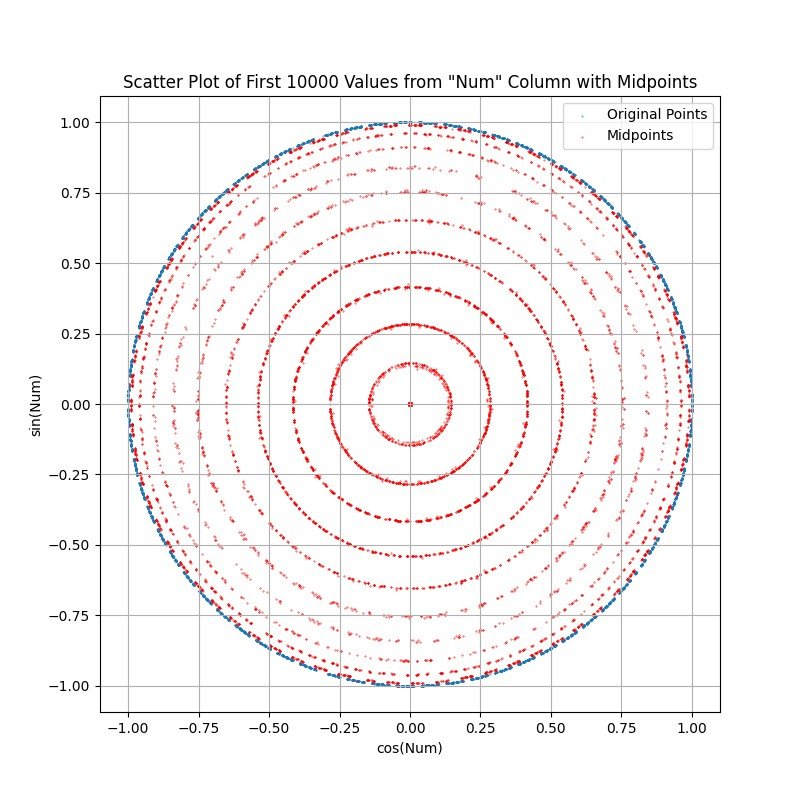
FULL PLOT 1M POINTS: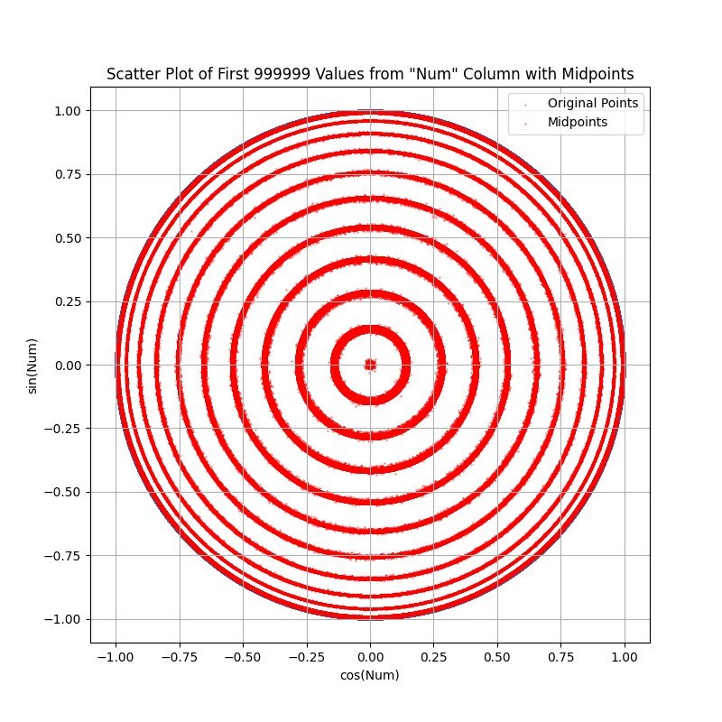
FULL PLOT 10M POINTS: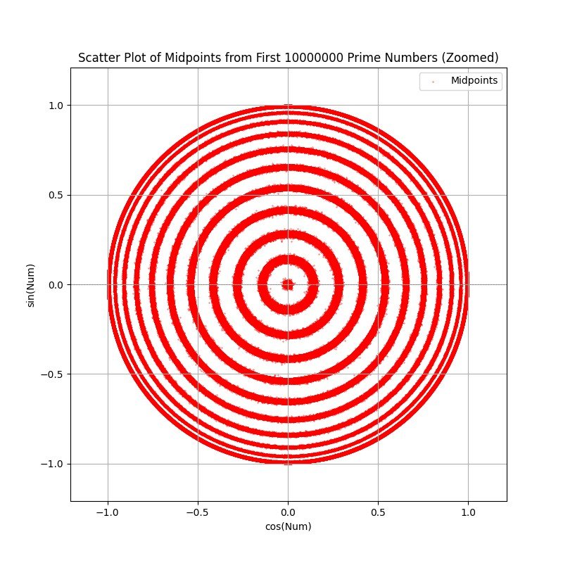
FULL PLOT 10M POINTS COLORED BY PRIME GAP: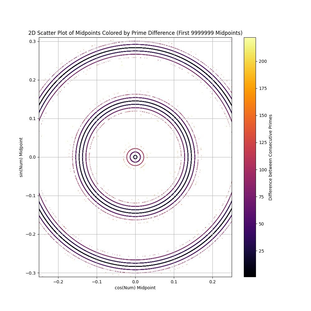
FULL PLOT 10M POINTS COLORED BY PRIME GAP ZOOMED: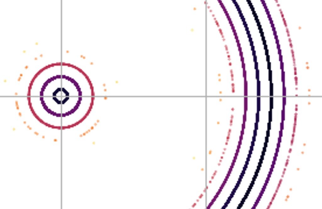
CENTER ZOOM 1M POINTS: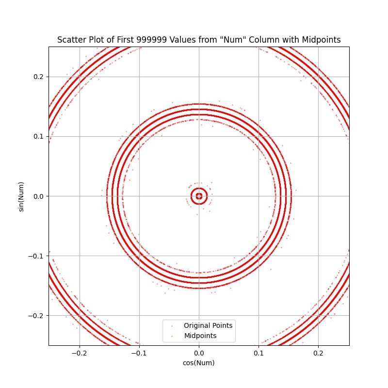
MORE CENTER ZOOM 1M POINTS: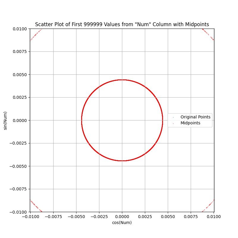
MORE CENTER ZOOM 10M POINTS. THE CENTRAL RING DOES NOT APPEAR TO HAVE CHANGED: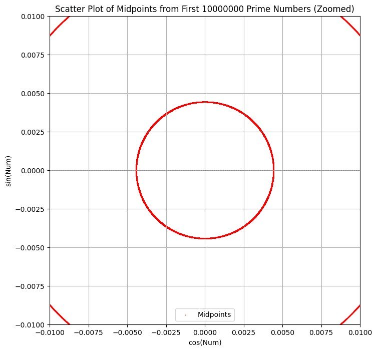
RIGHT EDGE ZOOM: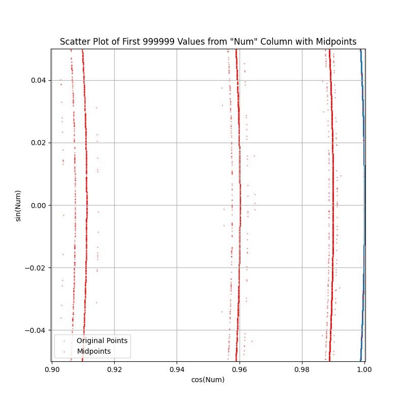
1M POINTS LOCATION HISTOGRAM: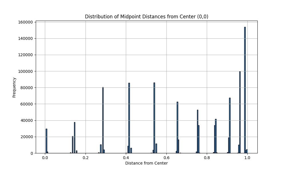
10M POINTS LOCATION HISTOGRAM: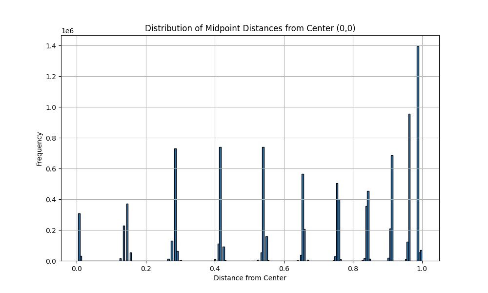
FOR COMPARISON...PLOT USING SAME FUNCTION BUT WITH FIRST 1,000,000 NATURAL NUMBERS: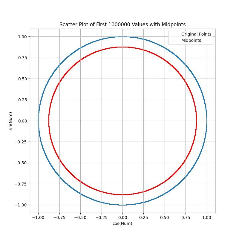
FOR COMPARISON...PLOT USING SAME FUNCTION BUT WITH FIRST 1,000,000 n+10 NATURAL NUMBERS: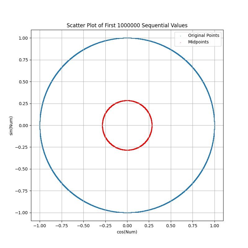
I think this relates to the gaps between primes / prime counting function but I did not expect to see distinct structure. The normalization method is somewhat questionable since (I think) the large numbers just spin around the circle until all the 2*PI terms are subtracted and the remainder lands on the circle. Is this a known visualization? How do these rings appear....is it just an artifact of how I normalized the data, or does it have some meaning/use?

Answer
- The questioner was satisfied with and accepted the answer, or
- The answer was evaluated as being 100% correct by the judge.
-
The rings come from the interaction between prime gaps and modular residue structure. Each band corresponds to a family of prime gaps hitting consistent average angular positions. The gaps appear because only certain combinations of (gap, residue class) are possible, so the midpoints cluster into discrete radial sets.
-
The gap comes from the trigonometric mapping (distance of a midpoint from the origin). Since every point lies on the unit circle, what really matters is how those midpoints distribute around the circle. Certain average angles get “hit” much more often because the primes are biased into residue classes (mod 6, mod 30, etc.).
-
Ok, so nothing earth shattering but maybe some limited use. I'll poke at it some more to see if the secrets of the universe are hiding in there somewhere. Thank you!
-
If you showed these rings in a classroom, people would instantly get that prime gaps are not random and they cluster in certain sizes. That is a tough idea to explain with equations alone!
-
You may want to change the scaling and see what happens. Instead of wrapping primes with angle = p (mod 2π), try angle = 2^(1/2)·p (or some other factor). If the rings stay, it means they are mostly about the gaps. If they vanish, it means they depend strongly on the specific 2π wrapping.
-
Instead of natural numbers, you may want to try comparing with random numbers. For example, generate fake primes with roughly the same average gaps (random odd numbers picked with probability 1/log n). Plot those, if the rings are weaker, then real primes have extra structure.
-
-
Ok, I'll put trying different wrap angles on the list. That might behave somewhat like another option... apply a small factor to the primes to see how the increasing gaps display. Right now, I'm working on a better visualization tool. I did make random numbers and there were rings, although not as nicely spaced. However I really couldn't conclude anything because I don't know what was baked into their pseudorandom generator. I'll have to find a generator that I can set the probability on.
- answered
- 1971 views
- $30.00
Related Questions
- Advanced Modeling Scenario
- Elementary num theory Q: or
- Wierdly Rational Fractions
- Quadratic residue
- Solve $abc=2(a-2)(b-2)(c-2)$ where $a,b $ and $c$ are integers
- Solve $x^{83}\equiv 7\pmod {139}$
- If both $n$ and $\sqrt{n^2+204n}$ are positive integers, find the maximum value of $𝑛$.
- Why even/odd coordinates correspond to positive/negative signs in elliptic curves

Could you explain how you plotted the original points and the midpoints?
Original points are the prime numbers and were XY plotted by making X=cos(n), and Y=sin(n), so they all plotted onto the perimeter of the unit circle. The midpoints are of the line segment between consecutive primes. Midpoint X = (X1+X2)/2. Midpoint Y=(Y1+Y2)/2. I hope that my notation is clear enough. Undoubtedly it could be better. You can see the rings emerge pretty easily in Excel if you scatter plot primes onto the unit circle, then turn on the line between points.
I'd be happy to take the question, but I think I need to go over the code you used to draw the midpoints. Would you share your code so that I can better understand your process and answer your question?
After the initial work in Excel, I made the plots in Google Colab with Gemini. I will extract a clean copy and post it.
I attached a .zip with the python code (generated by AI) for displaying the data. There is also a spreadsheet with an example of what originally caught my eye. Correct or not, I interpreted those emerging boundaries as line segments having a common length, or more simply for plotting purposes...the midpoints. Also, there is a chart generated by the included python code using only 1M primes. It takes a few more than that to create the rings, but this shows the beginnings.
I should have said that chart was generated using 1K points, not 1M points.